What Color Should I Paint My Room? A Complete Guide On Coloring Your Interior!
July 13, 2022Having your walls painted with your favorite color is one of the most amazing feeling ever. Your home feels fresh and the feeling of ‘new’ keeps you excited for good years to come.
Coloring your interior is all about playing with monochromatic, complimentary, and analogous colors. These color range are also the three types of palettes. Technically, these terms are most commonly used by most interior designers and you must know what they mean.
But before discussing them in detail, you must learn some important terminologies.
1. Primary Colors.
In the bracket of primary colors, we have red, blue, and yellow. These are unique colors and can’t be made by mixing two or more colors.
2. Secondary Colors.
In the category of secondary colors, we have green, orange, and violet. The reason why they’re termed as secondary is because they can be made by mixing primary colors together.
3. Tertiary Colors.
Tertiary colors are made by mixing half saturation of one primary color with full saturation of another primary color. These are intermediary colors and can be created by mixing primary and secondary colors. Blue-violet, red-orange, yellow-orange, and yellow-green are few examples of tertiary colors.
Coming back to the topic… We have three main types of palettes.
1. Monochromatic Colors.
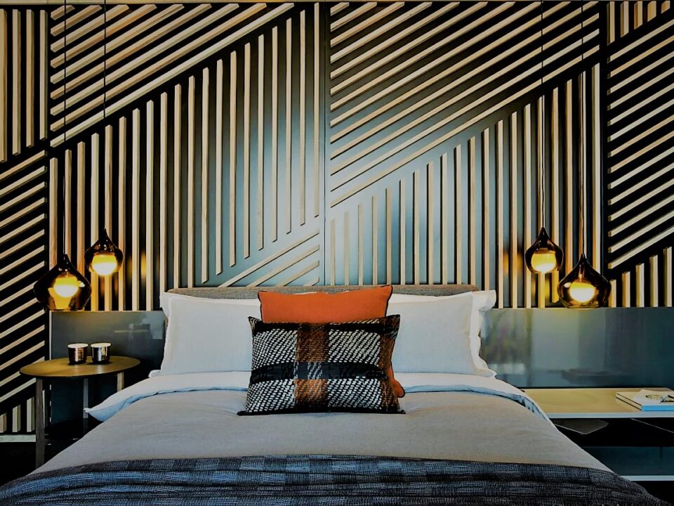
Monochromatic colors are the various shades from the same color. Shades are the colors used to give a darker finish and are created by adding black color. If you want to give your interior a minimalistic yet attractive look, monochromatic colors are the ones to go with. The various shades of a specific color will help you in keeping your interior simple, elegant, and not sharp and funky.
Monochromatic color schemes are used for small spaces to make them look larger. Playing with variations of the same color can make small spaces look more spacious.
2. Complimentary Colors.
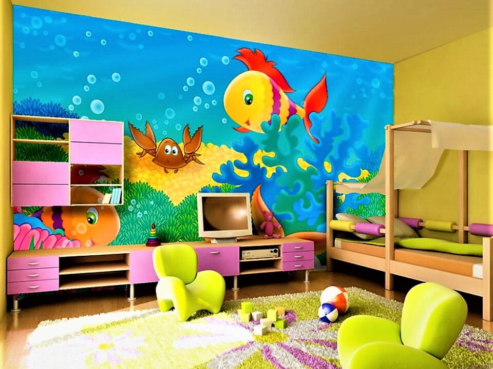
If being ‘bold’ is your goal, complimentary colors are all yours. You combine one primary and one secondary color to create a crazy bold color. These two colors must be the ones that cancel each other when mixed together. Canceling each other means to produce white, grey, or a black color when two colors are mixed.
For living rooms, bold color combinations are not usually recommended because of the fact that they directs attention towards the walls, not the room elements like your elegant furniture or premium centerpieces. For spaces like bathrooms and galleries, complimentary colors are best to use. Many cafés and restaurants use complimentary colors to create a colorful and attractive interior space.
3. Analogous Colors.
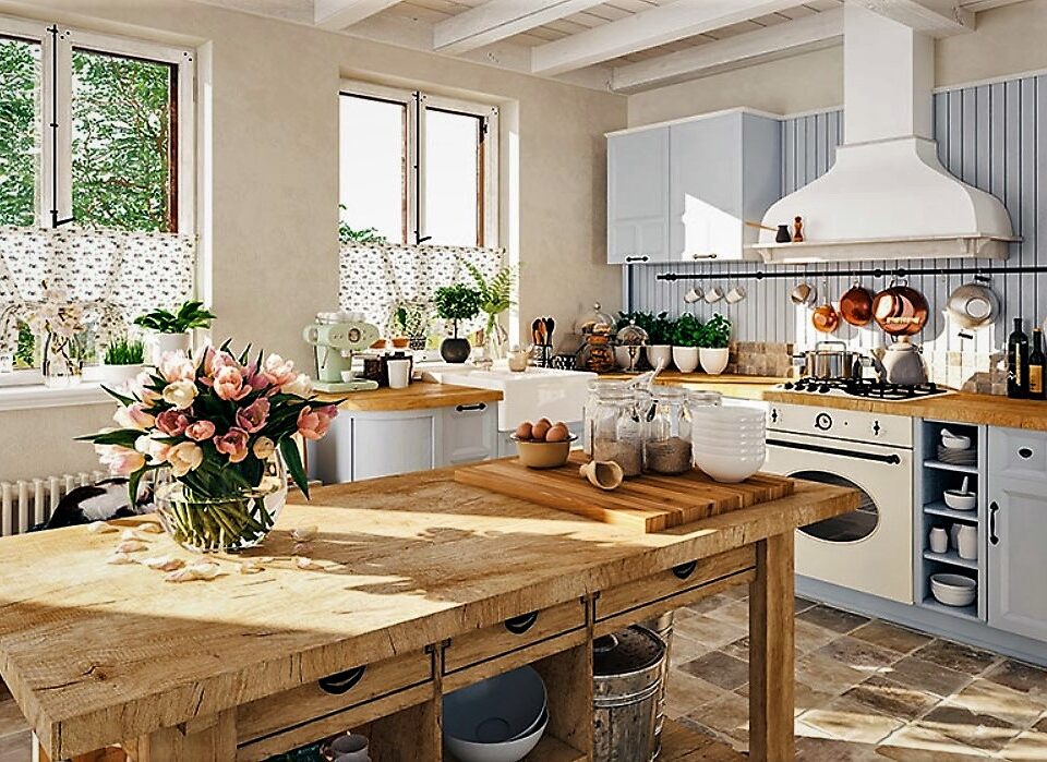
Analogous colors create a great range of stunning color schemes. These are made by choosing three consecutive colors from a color wheel in which one color is a tertiary color. These colors are mostly used by the designers when they want to emphasize one design element and create a major impression through it.
The color schemes that are created with analogous colors are mainly used for romantic, luxury, or natural theme.
Concluding Thoughts
So, the next time you wonder ‘what color should I paint my room’, this guide will surely help you out. It’s proven that colors have a lot to do with your emotions and behavior, so why not choose colors that not even look amazing but feel better as well.
Happy coloring!


